

drla06
-
Content count
21 -
Joined
-
Last visited
Posts posted by drla06
-
-
Desktop: Windows 8.1, TMG 9.5, 64 bit machine
Laptop: Windows XP, TMG 9.5, 32 bit machine
Can I take a backup file created on the 64 bit machine and open it in the 32 bit machine?
Many thanks for your help.
-
I chose RTF because I was having problems with DOC files. After downloading LibreOffice 6.1 I created family group sheet and journal reports using DOC format and it worked! Thank you for the direction.
-
Windows v 8.1, TMG v 9.05, LibreOffice v 4.4.0.3
I've created a family group sheet and saved in rtf. When I try to open the report in LibreOffice, this message appears "file format error found at 7,2 (row,column)". I also tried the same process with a journal report and received the same error message.
Is there a fix for this problem or any work arounds?
Thank you.
-
Thank you very much for the help.
-
Is there a maximum number of tags allowed per individual?
I have greated a psuedo-individual to use for a family group study. This psuedo-individual will be assigned as a witness to most of the tags for each person in the family group. This is where a maximum number of tags allowed may torpedo my family study.
For the psuedo person I will then print an individual detail report which will show all family members' tags in chronological order. This is an effort to facilitate a "cluster study" of the family.
Thank you.
-
Thanks for the instruction and advice. I have a family photo with Mom, Dad & 10 adult children which I'd like to place in a chart along with a descendant box chart which includes the same mom, dad and kids plus their spouses. Grandchildren and spouses would also be nice, but it's a large family.
Mike I always appreciate your examples -- they are truly motivating to take things to the next step. Thanks to all.
Linda
-
Thanks, Virginia, the image is in the chart.
Next question -- the image is much too large. it was scanned as an 8 x 10 " , but it's coming in as about 24 wide x 20 high. It's in jpg format and I'd like to display the image as an 8 x 10" in the chart. How can I get the image in at the desired size?
Thank you.
Linda
-
How do you insert an image into a chart? This will be an additional image off to one side or at the bottom -- it will not be associated with a specific image. Do I copy it from another application or insert a file?
Thank you.
Linda
-
Hi David,
I've been using the ancestor interest to collect a very special group of people. Direct ancestors (ancestor interest = 3) which I know you can determine is other ways. To this group I add siblings (including step- and half-) (ancestor interest = 2). And finally to this is added any step-parents of direct ancestors (ancestor interest = 1). This is how I easily gather the families that live together (and who are of most interest to me) to study the events of their lives. Hope this helps.
Linda
-
Mike and Terry,
Thank you for the very helpful explanation.
Linda
-
From one of the technically challenged --
How do you know if you have a postscript printer (mine is an HP Deskjet 841C)?
Do you need a postscript printer, in addition to one of the PDF programs, to create PDF files?
Thank you.
Linda
-
When inputting new family groups, using "copy tag" and "copy person" features (from the "add" menu) shortens the process considerably. Good luck!
Linda
-
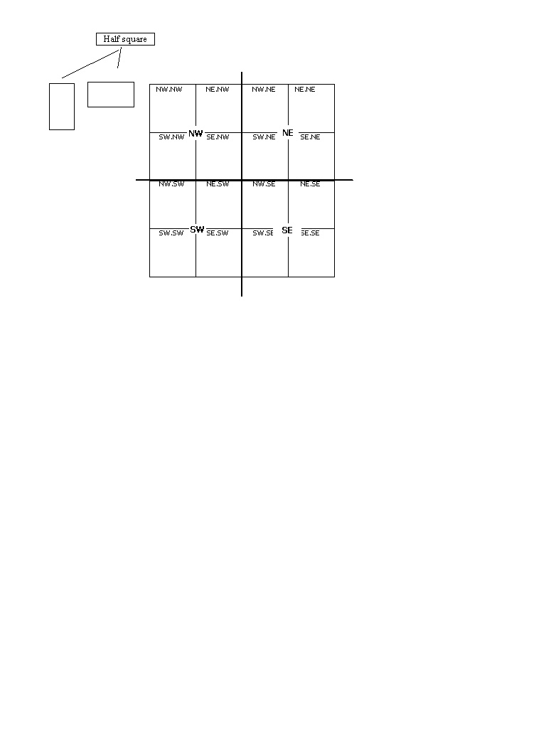
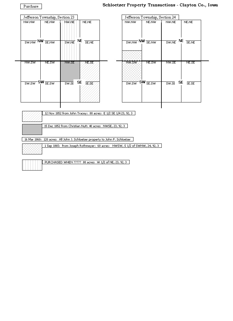
I almost always go through the legal description of property about 1/2 dozen times before I understand it and have it transcribed correctly. Pencil sketches help, but they usually get lost. So the attached property grid created in VCF was my solution to understand and display property transactions. There may be better and easier ways to accomplish the task. Also, the grid really only applies to the Federal land states where there is the nice grid layout. The chart in the examples reflects my limited experience with property transactions in the U.S. Midwestern states.
VCF allows the plots to be color-coded or pattern-coded to distinguish the transactions. If desired, the finished VCF file can be exported to a jpg format and attached as an exhibit to a deed tag. This format is early in the development stage and I not sure of the final usage, but I'm pleased enough with the result to consider outputting in a journal report.
One of the attachments shows the master grid file.
The other attachment shows the grid to display land purchases in Clayton County, Iowa. I plan to add additional grids to show when and how the family disposed of the land.
Method to create master grid:
-Start with a fictional person, with absolutely no family ties, and make a descendant chart for him. The box size was the determining factor so two 16-square grids could be placed side by side on a printed page. I settled on 66 x 66 pixels for the full size box.
-Repeat the exercise with a 66 x 33 pixel box to create the half-size box.
-On the VCF master grid file, make 15 copies of the full size boxes and assemble the grid as shown.
-Add a vertical and a horizontal line so it is easier to pick out the quarter sections.
-Add the text in the boxes, to increase plotting accuracy.
For the half-size box, I made one copy horizontal and then rotated the second copy to make it vertical as I have observed both types of plots in land transactions.
To use (a copy of) the master grid: Code the boxes as desired and add text to explain the transactions.
Hope this gives you ideas for additional VCF uses.
Linda
-
In July 2008 I wrote the paragraphs below to request a "blended individual detail report" for a group of people. The request did not generate a lot of interest. Your request seems to be similar, so there does appear to be an interest in easily studying the events of a group of people. To satisfy the need I generated individual detail reports for each of the group members and then combined and edited the reports in a word processing program. The finished report gave a very good sense of how the family was interacting at the time. The changes in relationships and circumstances, e.g., death of spouse, sibling marries, purchase/sale of property, move to another state, are given a new perspective when they are studied as a whole. The age information was not included in my report, but it would be welcome. I add my support to your request. Such a report would be a valuable addition to the TMG toolbox.
From July 2008: "There is a group of people -- father, mother, four children and the children's spouses -- for whom I needed to make one combined list of their events in chronological order -- sort of timeline of the people's lives. I printed the Individual Detail report for each person separately, pruned the events to only those needed, and then added the person's name to each event and placed the events in chronological order. The blended sequence of events suggested a new reason for the events that occurred -- something that would have been more [difficult] to pick out without looking at the activities of the entire group.
Because I've incorporated the research log into the person view, all my research notes appear in PV and research notes were the majority of the tags I used in the above report. They are quite lengthy, too long to use the list of events reports, which I would have exported to Excel."
-
Inspired by Virginia's video on connecting points, lines and ports I did a lot of experimenting in VCF the last several days. Zooming the display up to 800% (% may vary by computer setup?) was very revealing. I could see the 4 ports that make up the connecting point and try connecting to each of the 4 points. [see Robin's reply to Virginia's post.] While I still can't predict exactly what's going to happen, the zoomed-in display makes it easier to try different ports to attempt to improve connecting lines behavior. As in most software, VCF offers more than one way to accomplish a goal, i.e., delete a pesky, green line and replace it with a new line. Please pardon the repeated attempts to make the chart changes, but that's typical of my VCF editing <grin>.
You can find the video here
Below is the "script" that explains what I was trying to show in the video.
[Note: I am abbreviating connecting as "con"]
-
View > ports
-
Notice the con-point. If you have a larger chart, notice the location of the con-point related to the vertical and horizontal rulers.
-
View > zoom custom > 800%
-
Notice the ports on the boxes and the cluster of 4 ports that make up the con-point.
-
As each con-line is selected, notice the square gray box at each end of the line and at the angle where the line changes direction.
-
Each con-line is detached from the con-point, with varying degrees of difficulty. The green con-line would not respond so I deleted it.
-
Re-attach each con-line. Replaced green con-line with a new line. Changed color of new line to blue to make it easy to see square gray boxes on line.
-
Showed the overlapping lines by bringing either the blue or the yellow line to the front.
-
Using the bottom port of the con-point is not always the answer to making the con-lines behave, but it probably works for me more than 50% of the time. <so far!>
-
View > ports
-
Virginia, thank you again for a very informative video. While practicting the techniques, I zoomed the screen up to 200%. After selecting the area, it was easy to see the multiple ports of the connecting point. Then, I placed the beginning of the orthogonal line directly over the center port of the connecting point, clicked, then placed the cursor over the desired port on the target box, and clicked again.
It seemed that when the line placed correctly, it was because the cursor was placed directly over the CENTER port of the connecting point. If the line did not place correctly, then I selected the line and tried to adjust the end directly over the center port OR deleted the line and started fresh. You'll see the line immediately snap into correct position when you are successful. It became easier with a little practice. Can't say this will work every time, but I'd be interested to hear if others can duplicate the experience.
Before doing all the above -- when the lines are only slightly off due to editing, aligning the boxes may improve or even totally correct line placement.
Linda
-
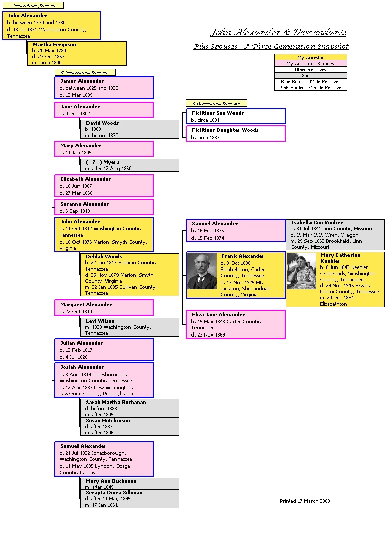
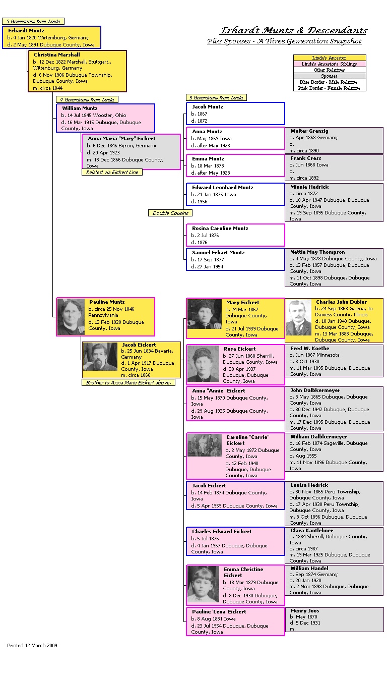
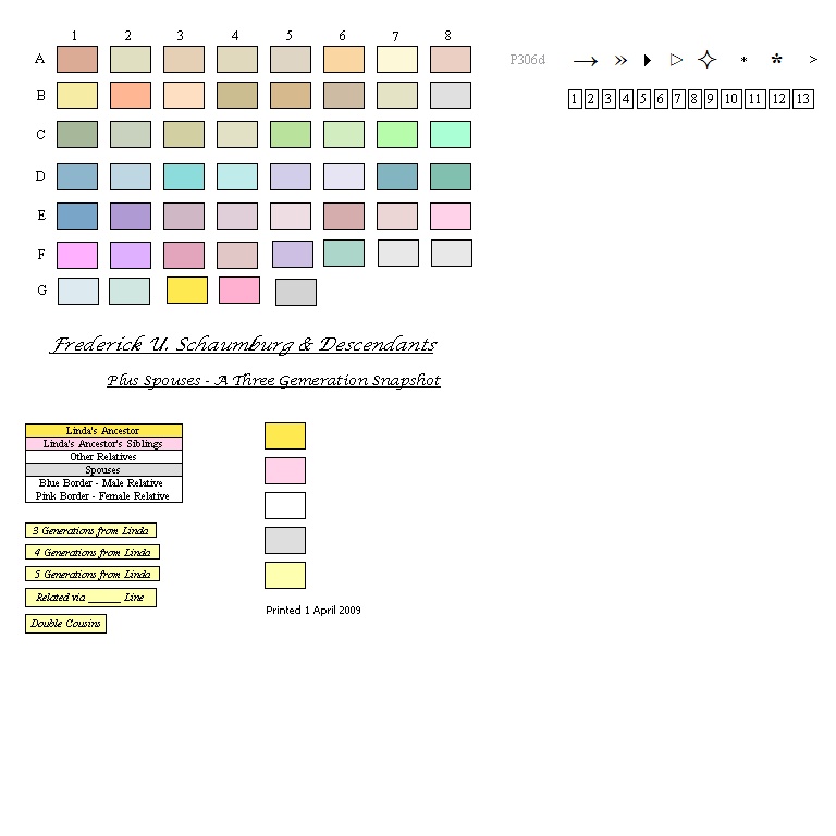
Viewing the sample charts from Virginia and Mike and using Virginia's tutorials inspired and taught me to make my own charts. I shared the chart based on TMG's sample database with Virginia and she asked me to post it to the forum – see below. I'd also like to share both Virginia's palette modified to my situation and then a chart tailored exactly for my family.
So far, I've only worked with the descendant format in the waterfall style. My goal was to compress 3 generations on a page as we've seen in some of the beautiful examples on the forum. The color scheme was adopted from one already in place for organizing my materials, based on yellow for direct ancestors and pink for ancestor's siblings. That required the addition of the legend explaining my color scheme. (The grand logic behind color scheme was that both yellow and pink papers were on hand when the organization project began!
 )
) Then I tried to put myself in the place of family members viewing the chart and answer the questions they might ask. That's how the little pale yellow informational boxes developed.
Some of the families had a large number of children and I was always asking myself how many were boys and how many were girls. That led to the colored borders around the boxes based on the old-fashioned color scheme of "blue is for boys and pink is for girls."
While I appreciate the importance of spouses, I wanted the related-by-blood people to have the most emphasis, leading to gray fill for spouses. If the spouses also happened to be related via another line, his/her box did receive a colored border (blue/boys, pink/girls).
It was very tedious to repeat formatting of titles, subtitles, note boxes, etc, so I added some of the "boilerplate" notes to the palette file Virginia supplied us so that it was easy to copy and paste.
I hope you can see how I started with the structures previously displayed on the forum and then liberally abused
them to answer anticipated questions and jog my memory. I also took the easy way wherever possible by adding common formats to Virginia's palette file. A shockingly bad memory led to the checklist shown below. It is very likely the format will be tweaked as feedback is received.VCF Descendant Report Checklist & Style Notes
Title: Font, Lucida Calligraphy, 12 point, Italic, underlined
"Erhardt Muntz & Descendants"
Subtitle: Font, Lucida Calligraphy, 10 point, regular, underlined
"Plus Spouses - A Three Generation Snapshot"
"3 Generations from Linda" notes above each generation: pale yellow fill with black border, Tahoma font, Italic, 8 point, black border
Ancestor: yellow fill with gender-determined border
Ancestor spouse: yellow fill with black border
Sibling: pink with gender-determined border
Spouse: gray fill with black border.
Determine any spouses "related by" other lines: add note "related via ______ line."
Related spouse: gray fill with gender-determined border, Tahoma font, Italic, 8 point, black border
Double cousin indicator: Tahoma font, Italic, 8 point, black border
When chart is finished, select all and group. Be sure to ungroup before making as changes, as a change will be applied to EVERYTHING if the chart is still grouped!
Legend
"Printed" date: Tahoma font, regular, 8 point, no border
Before printing:
- Select color printer, if desired
- Turn off "view ports"
- Turn on "print cut marks"
(See Erhardt Muntz desc chart for samples of most of these items.)
(end of checklist)
Linda

- Select color printer, if desired
-
There is a group of people -- father, mother, four children and the children's spouses -- for whom I needed to make one combined list of their events in chronological order -- sort of timeline of the people's lives. I printed the Individual Detail report for each person separately, pruned the events to only those needed, and then added the person's name to each event and placed the events in chronological order. The blended sequence of events suggested a new reason for the events that occurred -- something that would have been more to pick out without looking at the activities of the entire group.
Because I've incorporated the research log into the person view, all my research notes appear in PV and research notes were the majority of the tags I used in the above report. They are quite lengthy, too long to use the list of events reports, which I would have exported to Excel.
I'd like to request that this functionality be added to the Individual Detail report: selecting a group of people, all of whose events would be listed chronologically in a single group -- NOT as a separate report for each individual. I hope this isn't more difficult than adding a column with the individual's name, but I'm not a programmer.
Thank you for any help you can provide.
Linda
-
First, I am not an expert with this feature, but have done a quick experiment.
In the timeline folder, copy each of the Canada timeline files (.dbf, .dbt, and .doc) and paste the copy in the timelines folder. Rename each of the copies, e.g., MyAcadia.dbf, MyAcadia.dbt, MyAcadia.doc. Then, cross your fingers, the timeline should be available to you in TMG for your additions, etc.
By the way, I found a timelines folder in both the program folder and in my documents, TMG7 folder. I made the file copies in my documents, TMG7 folder.
Hope this works ok for you, as I said above, I'm not an expert.
-
TMG v. 6.00.0000
List of events report
Filter:
Field: Place
Operator: Contains
Value: Iowa
Output columns requested:
Tag Type Label
Prin 1: Last, Given
Prin 1: ID (sort 1)
Date
Place
Tag Type Label (repeated)
Printing to screen
I can do this this report for a specified person, but when I use the filter shown, the error message "missing operand 1336 XFILTEREVENTS" pops up. If I click on "ignore," the filter process goes forward, but there are no qualifying events.
Thank you for your help.
Linda
ldubler@mwci.net
Open 64 bit backup in 32 bit pc
in The Master Genealogist v9
Posted · Report reply
Many thanks for your help.