

RobinL
-
Content count
1,361 -
Joined
-
Last visited
Posts posted by RobinL
-
-
THe fan chart has very little control over the content of boxes, and the format of individual lines of text in those boxes.
A number of persons have made requests for a more flexible form of fan chart layout and content.
However, in my experience few people have sufficiently complete ancestral data to warrant the use of this style of chart. It may seem like a nice technique but it needs the right extent of data and extreme control over font sizes (to get smaller font height as the person gets further from the centre of the chart).
Some other Family History programs also produce this kind of chart, but in my experience these charts can be untidy - in one case the PDF production truncates and distorts text characters when the chart is over about 600mm in diameter.
I would advise you to describe what it is that you wish to show onn the chart so that others can give you some suggestions about ways of getting the output that is most effective.
-
When creating a bog standard chart I find that if a female is the single progenitor of a line [without a marriage tag] then VCR doesn't draw a line to her heir - is this a bug?Yes - this is a reported bug but I have no idea when it will be fixed.
You can insert that line yourself. An approximate description of this is:
From the toolbar "Link Orthogonal" button from one box to another.
Select that button, click on the middle bottom of the female box then click on the top middle of the child box.
On the second click the link should be drawn.
Then you can select that line to change its colour or thickness to match the rest of the chart.
-
I do fine when I can set the setting in VCF and have it print, but I am terrible at using it to move boxes, create new ones etc. Maybe you, Mike or Robin might consider a Primer for VCF for those of us who are challenged in this area.Take a look at the section on Editing Connecting Lines in VCF (GMTOOTMG, page 238+) as that will give you an idea of the issues involved. There may be a case for a separate VCF Primer that talks about the do's and don'ts in chart construction. I have not tried to compose one as it could quickly became out of date if some of the quirks were adjusted in an update or there was a major version upgrade. (I have a list of about 150 reported quirks and requests for enhancements but I have no idea when or if there will be a change in status of any of them.)
It would be better for you to describe the operation that you are trying to do and for some of us to describe how we would approach it. Because VCF editing can be very flexible there are usually several ways to achieve an outcome. Secondly, some sequences are more prone to user error than others, so the sequence of operations is important to get the desired result in the minimum number of steps.
I perform hundreds of these editing operations on the reshaped (compacted) charts that I create on an almost daily basis. HINT: As a general rule, it is better to copy then paste then edit the pasted object than creating an object from the tool bar - the toolbar objects can't always be edited to have the same propertis as the ones already on the chart!
-
Just thought that would put up another use of a rectangle behind the chart.
I prune various branches off the top chart by creating a flag and then using the "Include persons with flag value" option.
The sub-chart is produced by starting a second chart at the marked couple.
For family reunions, I then produce a series of charts of smaller size that are easy to display.
The top chart provides the linkage between the top charts.
I hope that this gives others ideas of how versitle VCF can be in getting the family story over to the audience.
-
Mike,Do you know how many pixels are across an 8x11 piece of paper?
Teresa,
VCF works at 96 pixels per inch. So you need to work out the non-printable margins on your printer to get the available distance, etc and calculate from there.
Robin
-
Thanks for putting up the example.
My preference has been not to fill that rectangle but to thicken its border and colour it mid-grey - it really depends on what level of emphasis you require.
It can be possible to achieve a simular effect by using a flag and accents. But not always if you already have a large number of accenting setups in use.
BTW: Did you know that you can also use any of the TMG supplied frames as fancy ways of adding this emphasis. These are in your Frames folder - see the TMG file storage help for the path navigate to.
In VCF, click on the "Add Picture from File" toolbar button and navigate to that Frames folder, select the frame that you want. (Selection is easiest if you put the file selector view mode into Thumbnails first.) The frame will be pasted at a large size which you will need to resize to your needs, then place then "send to back".
This frame technique also can be used to creating a border for the whole chart.
-
Some warnings about unexpected effects that you may run into:
1) If you select a generation that has some boxes with shadows and instead of changing the colour of the fill you choose to change the colour of the box outline, then that colour change will also be seen in the outline of the shadow!!
2) If you create a custom chart by cut and paste of two or more charts onto a single canvas, then when you select a generation, the original generation number of each separate chart comes into the selection. That is - if the starting box is 2nd generation of one chart, then select generation will also include the 2nd generation of every other chart on the canvas. These persons may not be at the same "real" generation as it depends on how each chart was created. In this case the colour by generation may mis represent the true situation - user beware - VCF can not know the real generation number. The user cannot edit the internal generation mumber for a box on a chart.
Otherwise, this encouragement to make more use of colour is very commendable. Keep at it, Virginia.
-
It is relatively easy to create some saved and reuseable elements that you can use to create your own chart border.
The trick is to make a corner element that is symmetric and a matching boder edge element.

In this example the two elements have been coloured red. Both the border and the corner elements need to be made of two or more drawing objects that must be grouped together to form that element. They need to be carefully constructed to be able to be stretched and flipped, copied and pasted to form the thickness of the border that you want (being a grouped object the internal parts will stretch proportionally). The length and width of the edges can be adjusted until you get the effect that you want.
Many designs are possible - this is a tip to encourage you to produce your own.
-
There 2 known issues about the presentation of text strings in VCF.
a. Text (name, place name, memo, etc) can get truncated without warning if a single word will not fit in the specified box width (remember to subtract the the image width if Show Images has been been selected in Chart Options). BTW: the image width cannot exceed half the width of the box. That is, VCF has no automatic word hyphenating and wrapping feature and does not automatically wrap at a hyphen - it only wraps onto a subsquent line at "space" character. Typically, you need to add a space after a hyphen in a surname to allow this wrap to occur.
b. There is a bug in the third party software library used to build VCF. If outputing a long word in a text string and that long word just fits in the box width then that tool does not show the first character on the next line. There is an extreme version of this when a number of long words occur in a name, first detected when generating charts for European nobility!
Both of these can be avoided by sensible editing of hyphenated names and appropriate increase in width of the box width or any multi-line text such as chart titles or other annotations.
-
In another thread Mike Talbot wrote:
Significant time would have been saved if TMG generated the "Relationship Chart" to VCF (still on my long time "Wish List").Here is a simple 3 step process to create a "Relationship Chart" in TMG/VCF between person with IDs M and N.
Step 1: Create a temporary custom flag REL_CHART (N,Y) set using the secondary output of the List of People report using filters like
ID EQUALS M OR
ID EQUALS N OR
( Is an Ancestor of ID M OR
Is an Ancestor of ID N ) END
and Then Add check [X] Spouses
Set REL_CHART to Y
Step 2: Run a standard Relationship chart bewteen A and B noting which case applies
M and N have a common ancestor C
M is direct descendant of N implying N is equivalent to C
N is direct descendant of M implying M is equivalent to C
Step 3: Create a VCF Descendant Box Chart starting at C
using the option only include persons with flag REL_CHART = Y
The rest is up to you create a layout and content of the VCF chart.
-
Some time ago I made a request that the Place Name system be extended to use a simular mechanism to the Person Name system uses for Name variants.
That is, that Places could have place name-variants associated with a Primary Place name. This would allow for names that are different with politics, language and date.
When entering a place for an event you could associate that variant with another Primary place name. This could be used for simplified reporting or filtering, but allowing the appropriate place name variant to be selected for reporting (in sentences) etc when that option was selected.
This would divide the Master Place List into 2 levels, Primary only and on the second level, the variants that are synonyms for that place. It would require some extra management when restructurung which Place name variant entry should become a new Primary entry.
I believe a variant of this technique would overcome the current "ducking and weaving" that is being attempted in this thread.
-
in VCF... I don't see the [Printer] button on that screen either.However... You should be able to select File / Print.
Select the printer and select [Properties] and make your changes there.
This is a serious problem as it negates the use of the Print Preview to check that custom page size actually works for the current chart.
I presume that this is a Vista / particular Printer driver issue - I don't have vista to check this out. It is likely that the currently selected default printer driver is the problem.
-
It sounds to me that you have a parent who is not not set to be a primary.
What happens if you start from a progenitor that doesn' t show on the pedigree and output a Descendant Indented Chart with the aim of showing your Pedigree focus person as part of that output? Does the disired linkage show up or not?
Robin
-
It has been brought to my attention that there is a mismatch between what is printed on a page and what is shown to be on that page when viewed on the Print Preview.
Some detailed analysis suggests that although the size of the printout is correct, what is actually printed on the page is displaced to the right and downwards by increasing the effective left and top margins by about 4 screen pixels in both direction (about 1/24") but keeping the right and bottom margins correct. This means that the printed image has about 1/24" (~1mm) missing at the right of and bottom of each page join.
This can be demonstrated by printing the default Descendant Box Chart from the Sample project starting a person #1 and examining the printed output. I have tried 5 different printer drivers - all show the same errors even though these printers have different printable regions on the same Letter sized page.
This may also impinge on the earlier problems of printing the cut marks.
I will report this as a bug.
The use of "Tools > Diagram > Repaginate" option will minimize the impact of this but at the considerable increase of chart size in a larger chart.
Robin
-
Hibut on the Vista laptop, when I open VCF, the toolsbars are spread over 4 lines. I moved them to occupy only the top two lines. But when I next opened VCF they had moved back to their original positions.
Tom
I can't tell that you are experiencing a Vista effect or a V7 effect. This has always happened to me on all previous versions and OS's. It has been reported in the past (long while ago). I believe it is something to do with switching between a resized VCF window, a full-screen VCF window, and the use of multi-monitors. Also although the VCF toolbar positions are saved in the registry it is obvious that depending on the way you open VCF those saved values are not always on honoured. If you can identify better the chain of events that allow it to use your previously saved settings I would appreciate knowing your observations.
In the meantime, I know of no certain fix for this problem.
-
Philipp,
There are some problems with long names and with word wrapping. It would help if you provided the box width and font name and size that you are using with an example name so that I can look at the exact case that you are experiencing. One of the effects is when the width of the box and the length of the last word on a line disappears or appears on the next line with the first 2 charaters missing. If you can work out how to make screen grab of such a truncated name in a chart and add it as an attachment here, then that would help to distinguish whether what you are seeing is a known bug or not.
Try changing the box width to see whether that gives you any clues of what is triggering your problem.
Robin Lamacraft (Adelaide, Australia)
-
I have tried many permutations
Like seach for "VCF"
and user "RobinL"
in the last 180 days and newer
in the the Visual Chartform forum
and many other cases to always get no results.
Clearly something is wrong with the board's search function.
-
Robin,I haven't learned all the features yet, but maybe you could give me some idea........ If there were a separate data set for a family unrelated (I'm thinking of slave owner families), could there be links or relationships or associations made between those two seemingly unrelated data sets?
For example, if I create a tag called slave or enslaved in the Tubman data set, identifying someone as a slave, and include info about their owner (name and location), is there a way of linking or creating a relationship with a data set for a slave owner?
Linda
Linda,
I would put all persons in a single data set in a project - this has significant adavantages later on.
I would create a customs flag (say TUBMAN) and give it 2 values (U, R) U = unrelated first as the default, then R = Related. Set the R flag using the secondary output of the List of People report with a suitable filter based around "is an acestor of" and "is a descendant of", etc.
I would enter the associate persons and make them "witnesses" to events. They can take a number of roles in n event. Take a look at Terry Reigel's site http://tmg.reigelridge.com/Roles-Tutorial.htm to give you an idea of what is possible. A witness is a person whose lifeline is impacted by the event, not just person present at an event.
Robin
-
Linda,
I work with many persons' data sets to produce charts. The biggest that I have generated but not printed was 302ft across. I often work with projects that contain more than 1000 persons, and occasionally with projects over 10,000 persons. The real issue is what do want the chart for and can you display it or use when you produce it. That is why I advocate cutting the tree into a number of parts that are cohesive and yet small enough to display (that usually mean less than 20ft wide or less than 6ft high). If you are looking to create a fold out for a family history book, create a chart and then reduce its size in VCF before printing.
Yes, Adelaide has its advantages as a place to live. Just recently created a new all-time weather record 15 concecutive days over 35C (95F), but that is unusual!
I hope you work out what chart is best for you.
Robin
-
Currently, there is no TMG chart layout available that does what you are asking.
These staggered alternate children or a one column of boxes per family layout strategies only work sensibly for the last generation of a chart. It becomes problematic in interpretation when some children have spouses and others do not. This often happens in larger families where older children have already married when younger ones are still at home.
The best and quickest solution to create a more compact chart is to change the orientation to left to right from top to bottom (Chart Options, General tab).
Another compact descendant summary is provided by the Descendant Indented Chart which is text-based file that can include names and birth, death, burial and marriage info but not other tags.
There are other methods of creating more compact charts, but each of these can't be easily automated. They rely on analysis of the internal structure of the descendancy tree, e.g. which branches are large and how are they positioned with respect to one another. One of the advantages of Visual Chartform is that it permits you edit, cut and combine charts to achieve the presentation that best suits your needs.
COMMENT: Occasionally, someone on the forum asks for a chart that includes "everyone". I have not seen a satisfactory layout for these charts when they have been applied to to data sets over about 300 people. The positioning of persons means that almost always there are long lines connecting individuals and these lines cross many other lines. It is often difficult to follow such a long line when it placed amongst many other parallel long connecting lines. The reader just gets lost.
-
Hi Franz,
What is the size of your .VCH file?
I still have VCF v1.2 installed.
One way to convert a VCH file to a VC2 file is
- to open the chart in VCF 1.x,
- select all and copy it all to the clipboard
- open VCF 3.x, and paste the clipboard onto a blank canvas
- save the chart as a VC2 file
This conversion is not perfect and sometimes does not work.
If this VCH file is less than 5Mb then email as an attachment to here
I will try to convert it for you.
Robin
-
I did report this, but this was before the WG forum existed. Once that was instigated, the old request list seems to have been forgotten. So I fear that the request has been lost.
Besides there have only been 2 updates to VCF since that date; Mar 7 2006 build 3.2.0.2 (v6) and Sep 1 2007 build 3.2.0.13 (v7). Neither of these updates has addressed this issue.
-
I don't know what to say. This sounds like a project not an install problem. Are you trying to include images in your chart? Have you looked at the files in the logs folder to see whether there are any clues? DLLs or OCX that did not register, etc.
Does your project work as you expect on someone else's computer?
-
Shane,
Which Operating System are you installing TMG v7 on? (W2K, XP or Vista)
Have you installed to the default folder paths?
Are you outputing to "View in Visual Chartform"?
I have not seen this effect on W2K or XP, don't have Vista to check.
Try again with a reset report configuration.
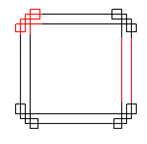
Chart editing
in Visual Chartform and Chartform Delivery
Posted · Report reply
What you are telling us (by getting apprarently blank extra space to the right after Size to Components) is that "there are objects out the right" on the canvas.
Please use CTRL+A and that will put up placeholder markers for objects (including those which ARE NOT NORMALLY VISIBLE). You must have at least one object near the right edge of the canvas to get the result that you are seeing. CTRL+A will show you where these are!!)
I now suspect that you have dragged a box on your chart and you did not ALSO MOVE the connecting line intermediate connecting port as you did that action.
Delete any object out at that edge and then re-do "size to components".