

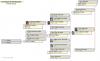
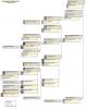
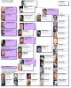
Mike Talbot
-
Content count
361 -
Joined
-
Last visited
Posts posted by Mike Talbot
-
-
Thanks Terry, Michael, and Mike. While it seems gruesome to mix thousands of unrelated people in one project, guess that's the answer. And use flags to separate them out as needed.Note sure this reply will get thru because I can't find a "Send" button or even "Send reply" -- Thanks again, George
Your message got through with flying colors.
It all depends on your genealogical interests. My interests run from ancestors, to cousins, in-laws, in-laws of relatives, friends, relatives and in-laws of friends, historical and otherwise famous folks, along with the nobility and royalty, etc. It is amazing who is related to whom and in turn to me. With separate datasets one could seldom know.
A quarter of a century and 81,000 people later, my only regret is that I had not started building my lone working dataset sooner and thus be much larger.
I do have several separate datasets in a few projects where I keep (for reference use only) data sent to me by others.
Your interests will probably widen, so please don't throw any data away.
Best wishes,
Mike Talbot
-
I'm new at this messaging system (forum) so please bear with me.It seems (see above) that TMG has a major fault in design. One cannot create two projects or two datasets in one project and avoid double data entry. If I'm wrong please advise.
More specifically... I have a project with all my family in one dataset. My goal is to create another project or dataset with duplicate persons and avoid double data entry The solution, it seems, would be to have a parent project or database with children projects or datasets. A change in linking (duplicative) person would be reflected in the parent or child dataset. Is this wrong headed?
Thanks, George
It is good design for TMG to allow as many Projects and Datasets as you desire. Users may use or abuse this design feature anyway that they choose.
What is bad is for a user to employ more than one working dataset. Then you have multiple entry of data problems.
Make all of your additions and changes into your single TMG master dataset. When desired, remake your focus group and then regenerate your separate dataset, if you must have one, with List of...People as previously described. It's not that hard.
To try to avoid getting into semantics, the type of TMG related database that List of People can generate is a dataset. It is a user option whether the secondary output stores that dataset into a new or into an existing Project. A Project is a simple way for multiple datasets to share a single common index, when desired. You can not link persons in one TMG dataset with persons in another. They are separate, regardless of Project structure. Yes, I wish that wasn't so, too.
It is similarly true of generating a SQZ backup file or GEDCOM file. Either is a different and smaller format for storing a single TMG dataset (many files) into a single file, regardless of whether that dataset was in a Project by itself or in a Project with other datasets. The differences between SQZ and GEDCOM formats are: most genealogy programs can read GEDCOM, only TMG can read SQZ. Also, you will loose some data details with GEDCOM.
Best wishes,
Mike Talbot
-
Mike,There two side effects of using the marquee method selection (enclosing objects witha dragged out dashed rectangle)
1) You select more objects than you expect (including the floating connection ports and spouse connecting lines), whereas the menu item only select the boxes.
2) if you select using a marquee and then use right-click Properties, your action will apply to all objects in your selection, so changing the line thickness or colour, will apply to all lines in your selection, e.g. the outline of the box and the spouse connectng lines.
Thanks for those timely reminders, Robin. One should always make group selections with care. A little practice will keep you from unintended consequences. But do make frequent backup copies of your intermediate work.
Group selections are often made to delete those misleading little connectors that make spouses resemble descendants. The spouse boxes can then be group selected and jogged up to touch (or sometimes even overlap) the respective descendant boxes. There are several ways to handle multiple spouses as seen elswhere in this forum.
One can also group select groups of generations, etc., to shorten connectors between generations and others. VCF seems to always make boxes farther apart than configured by the user.
Best wishes,
Mike Talbot
-
Greetings,I have been playing with VCF again and I find that when I use the edit function "Select siblings and spouses", only siblings are selected.
I have searched the forum for this, but to no avail.
Is it just me? or is there a bug in VCF?
Regards,
John Liddle
Using TMG 7.03 VCF, this feature worked as advertised on right to left or vs.vs. descendant charts for me, as it did for Robin. (I never use top to bottom or vs.vs. charts.)
As a work around, until your problem can be resolved, try using group selection with your mouse.
View, zoom to fit (needed for charts larger than the screen, only).
Then position mouse cursor just outside any corner of the components to be selected, hold down left mouse button, move mouse cursor to just outside opposite diagonal corner enclosing all desired components. When you release the mouse button all components in that temporary rectangle will be selected.
I always use this method of component group selection by mouse rather than the menu entries. It's quicker. more versatile and more intuitive.
I do not do charts larger than 36 x 48 inches. VCF hand editing is slowww and impractical on larger charts. You can always find a way to break a large chart into multiple smaller charts or be satisfied with a report.
Good luck,
Mike
-
Is there any way to create a new project using information already entered into an existing project in TMGv7. I need to seperate a part of my project to send without exposing my entire project. Do I need to start from scratch or can I seperate a part of my project to create a new project. Any help would be greatly appreciated.Vince
TMG is great for this. Create a Focus Group of those people that you want to give to someone. Name it while saving it to disk.
Select Report in the TMG tool bar. Click List of…, click people. Follow the wizard and fill in the blanks specifying use auxiliary output employing your above named Focus Group, just created above. Your new and separate TMG dataset containing only those persons in your Focus Group will be generated.
Good luck,
Mike Talbot
-
MIKE,Thanks for the great ideas. I tried them step by step and -- sadly -- the system still crashed.
Reducing the link distances, box borders, etc to minimums did not substantially reduce the horizontal dimension of the chart. (It did cut the vertical by a little less than 50 per cent.
Also, jpg size on export reduced minimally -- from about 299 MB to 288 MB. (I suspect we're still over VCF's maximums with that.)
As far as cloudiness of the image posted online, I suspect some of that is in the conversion process to JPG... and some may be in the AOL browser.
So the questions remains -- how to display on the web the huge expanse of this family? The limitation seems to be in VCF's lack of controls on its export features. I mean, it'll send a high-res file to the printing company... but won't allow export to relatively high-end standard graphics software.
skolnick
Have you tried generating a BMP export of your huge chart? A BMP of your big file would take hours to upload with even a high speed connection, assuming that you had a program that would do so.
If all else fails, there are several commonly available programs that translate BMP to other file formats. Of course, if VCF freezes on exporting your chart to BMP, this message is moot.
Translation of BMP files to other file format experiments:
TIFF format files were larger than the source BMP file, so thus are unusable.
GIF files were only slightly larger than the same image in JPG, worth looking into.
PNG file sizes were about midway between JPG and BMP, so seem impractical.
I have no programs that can do anything but display or print a PDF file, so no comment. The PDF files that I have seem large per content. There are many other possibilities to which I don’t have access.
Good luck,
Mike Talbot
-
I googled "JPG size limits" and found a number of sites that suggest that 65K is the technical limit, while some some image processing tools cut-out at 30K in either direction.Also, it seems as if TIFF does not have such a small limit.
And if you have the right software the latest PostScript/PDf has a limit of 300K per side.
I think that your problem may be due to the 3rd party ULead tools that uses to process JPG files.
You may do better to output to an appropriate PDF psuedo printer.
I don't think it is a problem of VCF's making but the image format that you are trying to use.
In 7.03, VCF Export has only 3 output format options: JPG, BMP and EMF(whatever that is).
To test a large chart (21 x136 inches), the following exported file sizes resulted:
JPG 3,474
BMP 76,209
EMF 48,836
(VC2) 47,845
There are no other options in VCF for export output file type.
What to do? Help,
Mike Talbot
-
MIKE,Thanks for the great ideas. I tried them step by step and -- sadly -- the system still crashed.
Reducing the link distances, box borders, etc to minimums did not substantially reduce the horizontal dimension of the chart. (It did cut the vertical by a little less than 50 per cent.
Also, jpg size on export reduced minimally -- from about 299 MB to 288 MB. (I suspect we're still over VCF's maximums with that.)
As far as cloudiness of the image posted online, I suspect some of that is in the conversion process to JPG... and some may be in the AOL browser.
So the questions remains -- how to display on the web the huge expanse of this family? The limitation seems to be in VCF's lack of controls on its export features. I mean, it'll send a high-res file to the printing company... but won't allow export to relatively high-end standard graphics software.
skolnick
The blurry poblem is definitly with my aol display. If I use MS explorer for display and slowly and carefully expand a section of your example chart, it displays perfectly clear.
I think that John's message on the freeze problem is correct. The problem may not be related to byte size of the file, but rather the width or length of your chart in pixels.
In a message (see above in this topic), Robin stated that the maximum size of a jpg image side is about 65000 pixles (dots). VCF outputs 96 pixels per inch to jpg files. If Robin is correct (she always is on this kind of thing), I would assume that the jpg spec uses a 16 bit unsigned binary number as its pixel counter (actual max number = 65535). Robin indicated that this max linear measurement is a jpg format limit, not an artificial VCF limit.
Try some experiments with this consideration. Please specify width, length and file size of both your successful (your hyperlinked example display) and failed experiments in future messages. (naturally, the failed ones wouldn't have a file size)
Your example display is great! It's fantastic that you have gathered all of those portraits. If I can help let me know,
Mike Talbot
PS: to my wish list, add that VCF actully follow the lengths for connector lines as specified by the user configuration when at all possible. VCF lines come out much longer and waste a lot of inches in a chart. On small charts (letter, legal size and a little bigger) one can hand edit out the waste. On a huge chart, like yours, when you really need it, hand editing is impractical.
Sorry for the garbled last half of my prior message. The forum wysiwyg editor is still a bit wild at times.
-
Sorry. I've been sidetracked on an unrelated project for a few weeks and am just getting back to this issue.I've come up with a way to replicate online a VCF wall chart... to some extent. You can see what I'm playing around with here -- http://www.paulskolnick.com/tree.html.
The steps are these -- 1) export JPG of the full family tree from VCF. 2) Open exported JPG in PhotoShop CS3. 3) Use PhotoShop's "Zoomify" feature to create an online, zoom-able family tree.
To my eye, the results are much better than the clunky add-ons TMG and VCF provide. For one thing, much of the data about individuals is on the chart. For another, each individual has a thumbnail photo (not allowed, as best I could tell, in any of the other add-ons or methods.
The issue is how best to share with an unlimited number of others the full scope of the family tree... and to do it in a way that will allow for additions and changes relatively easily. In other words, the VCF files BECOMES the virtual wall chart... and pretty standard web technology would allow the addition of hotspots, etc. to jump immediately to an individual.
Can the tree be broken up? Yes, it can be. However, I'm notificing that spacing becomes an issue in trying to add individual branches into a cohesive whole in PhotoShop. The whole in that case is, graphically, less than the sum of its parts.
Look forward to any ideas you may have.
skolnick
I liked your display. I looked at your example and don’t see a problem, except display was a bit blurred using aol. It was slightly less blurred using MS Explorer for display. That blur problem is probably with my aol (along with other of my problems), since the symptoms changed in subsequent calls.
This doesn't address the VCF freeze prroblem. I recommend that you try the following chart definition parameters. They should at least improve your chart in size and appearance.
Set box connector line lengths to the minimum allowed limit.
Major reduction in chart length by TMG chart definition options that cut down number of lines per box as follows:
Under data types use
For Focus person, Descendants, Spouses, etc.
use
for b, d, m, single line - Group Abbr Date Place (everything that fits for the event takes only one line)
for Place preposition - select blank.
Boxes:
Try width around 176 (a little wider box will result in far fewer average lines per box)
Consider a smaller box-border line width.
Set minimum box height to 0.
<H1 style="MARGIN: 0in 0in 0pt">Other</H1>Misc.
Select Remove blank lines (gets rid of lots of blank lines)
Allow word wrap (prevents truncation in long name and data lines)
<H1 style="MARGIN: 0in 0in 0pt">Text</H1><H1 style="MARGIN: 0in 0in 0pt"> try fonts</H1>Names Tahoma 8 b or 8 r
Data lines 6 r or 7 r
<H1 style="MARGIN: 0in 0in 0pt">Images</H1>Try maximum width around 68
Good luck,
Mike Talbot
-
I wondered if anyone has successfully customised the Family Group Sheet.I rather like the format as something I can give relatives to fill in vital informaiton I am missing from their branch of the tree, like birth dates/places etc.
What I'd like, is this report, to include all descendants of the subject, rather than just the immediate family.
Possible or not?
TIA
Neil
It takes a little work. You must output all needed reports to TMG supported word processor files.
1. Run the standard TMG FGS report.
2. Run a TMG Descendent Indented Chart for each child.
3. Copy each child's descendants from step 2 into your step 1 FGS file at the appropriate spot.
4. You can hand edit the resulting composite FGS to your taste, if desired.
Done.
Best wishes,
Mike Talbot
-
http://www.lawrencefamhis.com/Besides extensive information on the Lawrences of Ashton Hall, Lancashire, England and descendants of Robert Lawrence of Isle of Wight Co., Virginia, other family pages are include for the following surnames: Bondurant, Boone, Brown (Braun), Bumpass, Burnett, Byerly, Daniel, Daughter, Hardy, Harper, Harr, Hinton, Hill, Kincaid, Leonard, McMurry, Mullins, Rose, Sloan, Stansbury, Towne, and Wilhoite/Wilhite.
Site was created 100% with Second Site include the home page that links to all other family pages.
(Note to Moderator: This should replace the site currently listed for me on this forum.)
Paul:
Have you looked at the following data?
http://geneweb.inria.fr/roglo?lang=en;i=2395034
There is some added ancestry of the Joyeuse/Retz, ancestors of the Bondurant, maybe others.
Have used this website for over a decade and have found it to be unusually reliable. They also have a good forum.
Good luck,
Mike Talbot
-
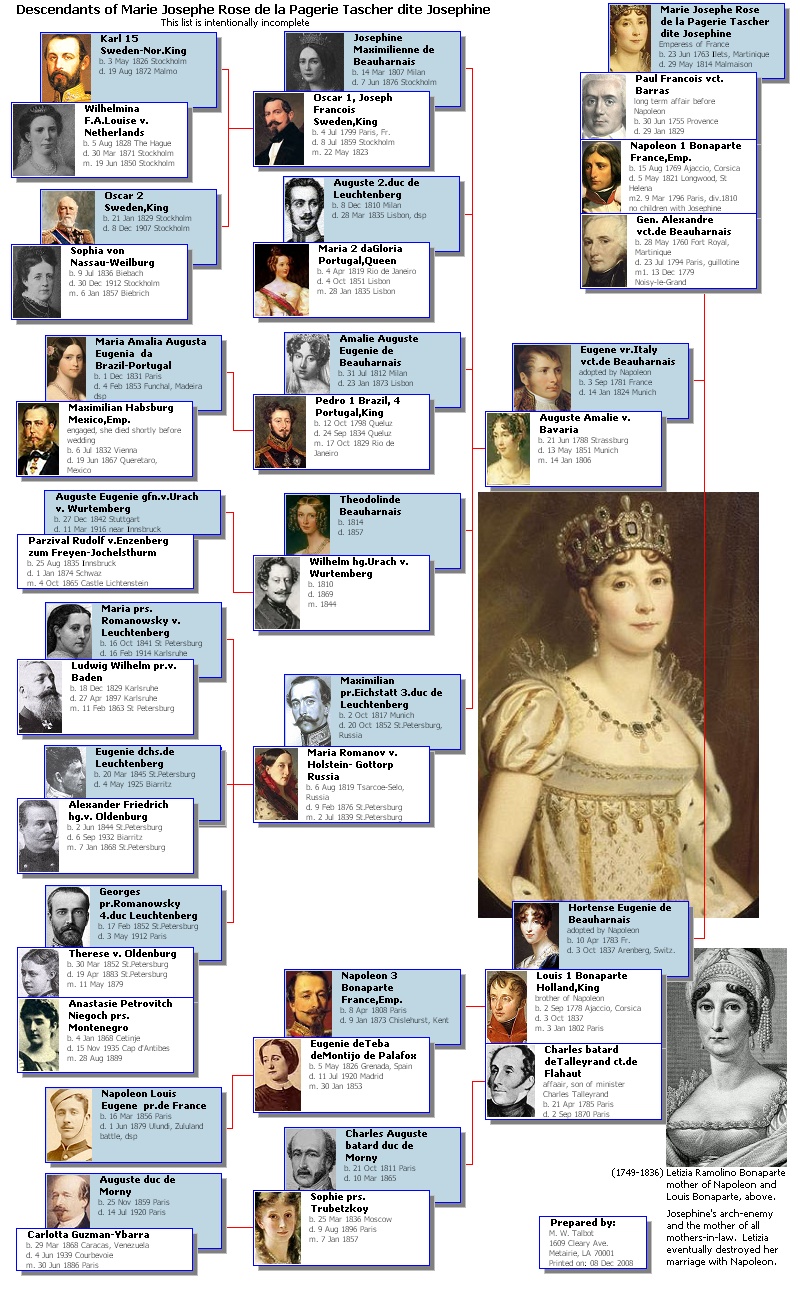
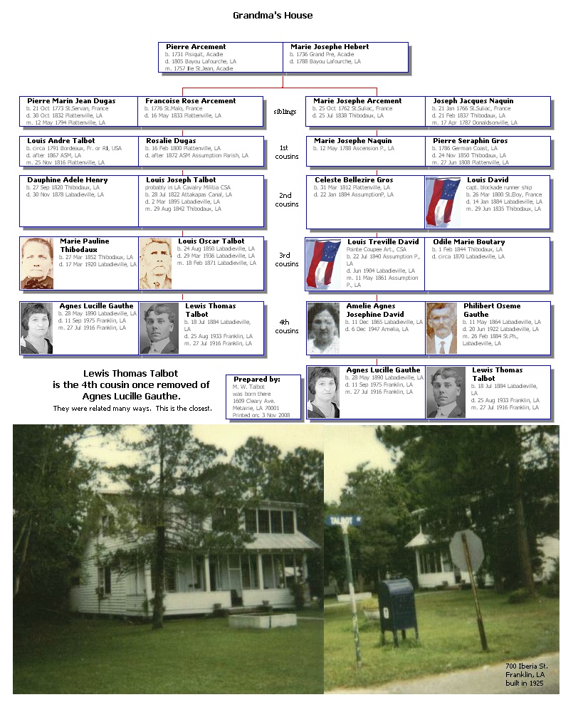
A Christmas Idea
Produce a set of a descendant and an ancestor TMG-VCF chart for your favorite relative. Place the two charts back-to-back in a transparent sheet-protector and attach it to their present.
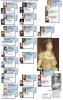
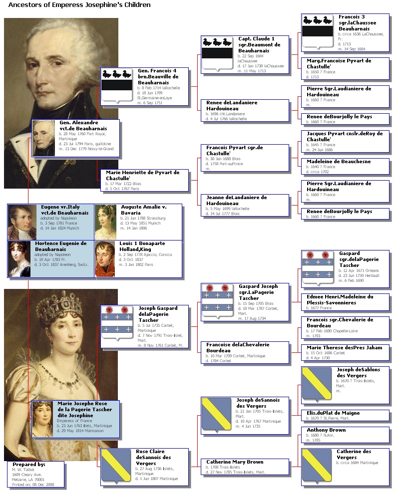
Examples of the types of charts that make perfect gifts are attached, using Marie Josephe Rose de la Pagerie Tascher as the example subject. Her family and friends called her Rose, but her second husband called her Josephine. History remembers her as the Emperess Josephine, first wife of the French Emperor Napoleon Bonaparte.
See previous posts in this topic and those topics started by Virginia for the methods used to produce and edit such VCF charts.
Josephine's 4 gen. descendants are VCF edited to fit on legal size paper and her children's 5 gen. ancestors are edited to letter size.
If you need help or have suggestions, post your questions and comments in this forum.
Merry Christmas and Holidays,
Mike Talbot
-
My wife's cousin, many times removed, has provided a GEDCOM of his research, including citations and media to me. I have successfully imported it into TMG v7 Gold. I want to extract my wife and her ancestors from the data. OR the reverse, I want to remove all not in a direct linage to my wife.How do you select a individual and their ancestors for export OR delete all others from the data?
Jim has given you a good overview of your options.
A specific procedure, if I understand your message, properly: Open your wife’s cousin’s TMG dataset that you have already created. Access your wife’s record. Click on the Focus Group icon in the TMG tool bar. Removal All remnants of any previous Focus Group.
Then, Add Individual… your wife. Click to check Ancestors. Enter the number of desired generations, usually 40 will do, beyond that is largely mythology. Uncheck descendants and spouses. Check name variations, if desired. Click on add others, a list of names of only your wife’s ancestors is created. Save and name your wife’s Focus Group.
Select Report in the TMG tool bar. Click List of…, click people. Follow the wizard and fill in the blanks specifying use auxiliary output employing your wife’s named Focus Group, just created above. Your new separate dataset containing only your wife and her ancestors will be generated. There is no need to generate an intermediate GEDCOM.
Also keep cousin’s unaltered dataset as a reference, if practical. As Jim alluded, it’s all easier done than said.
Good luck,
Mike Talbot
-
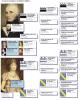
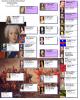
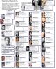
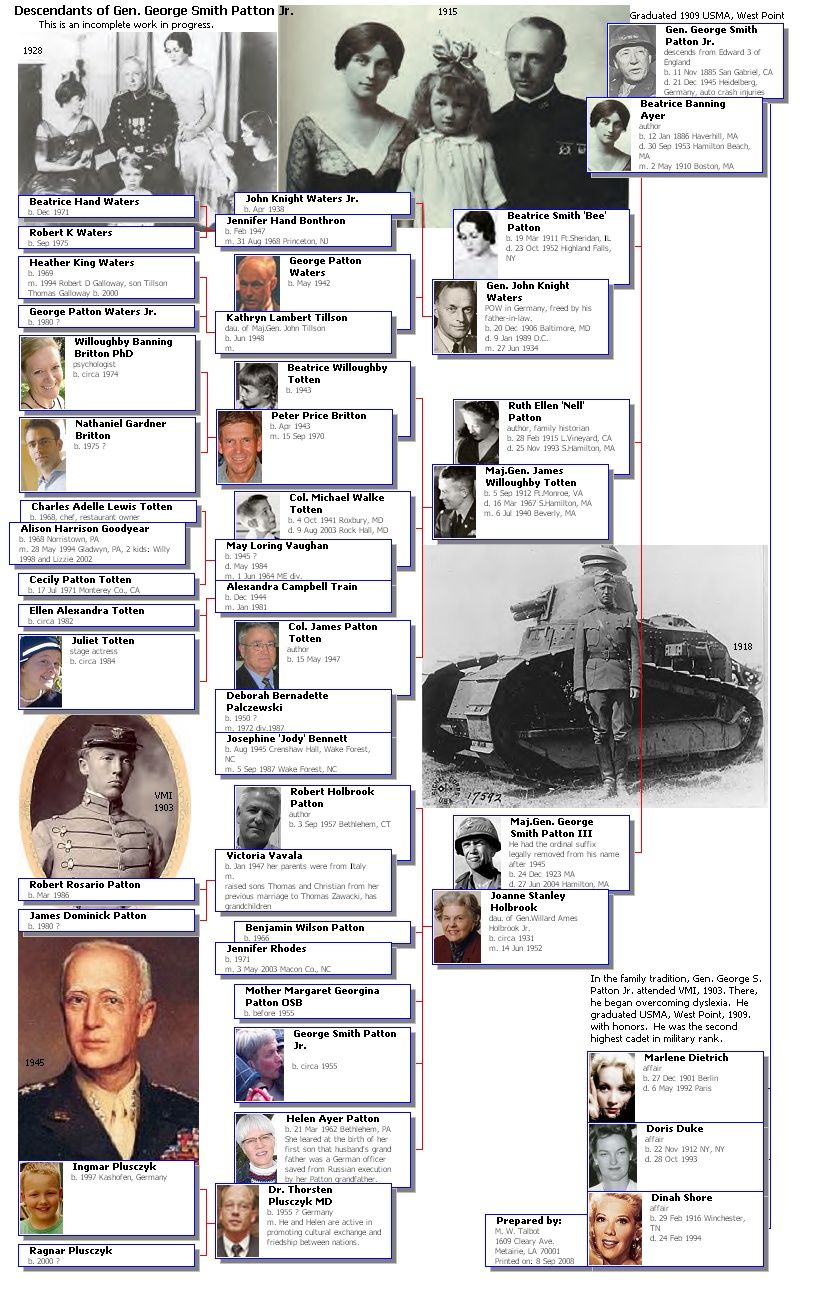
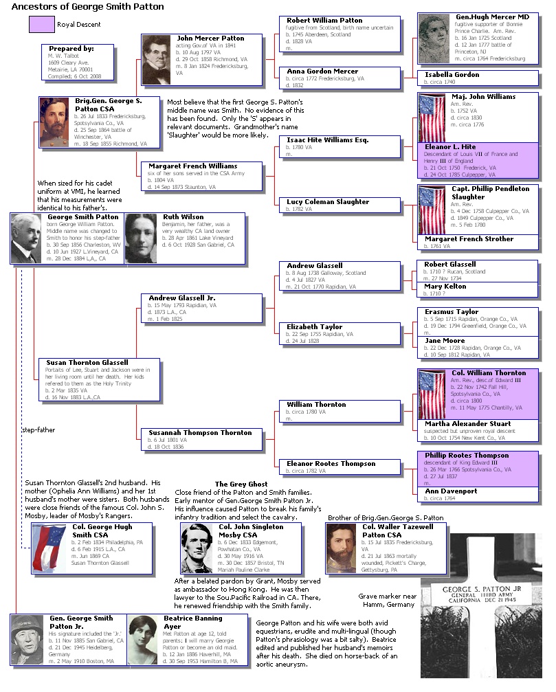
The attached 4 generation descendant chart was edited in VCF to fit on legal size paper (8.5 x 14 inches). The unedited chart, as generated by TMG, was 12 x 16 inches.
Gen. George Patton's ancestry chart was posted in a previous message in this topic. General Patton’s Descendant Chart was chosen for two reasons. Many of the complexities of most families are found among his descendants. And, to further honor the finest military mind of the 20th Century, perhaps in all American history, in my opinion. Had Patton’s political skills been commensurate with his military skills, WWII in Europe could have ended a year sooner. Casualties on both sides would have been significantly reduced. Central Europe would have been saved from almost half-a-century of oppression and stagnation in the communist abyss. The “Cold-War” may not have been. Again, all of this is my considered opinion from a study of the actual events.
The goals for editing the large chart were to make it fit on a standard paper size and to eliminate the confusing connector lines between descendants and their spouses. Two rules were self-imposed for this clarification. Descendant and spouse boxes should touch or even overlap where possible. Spouse boxes should remain offset from descendant boxes, but perhaps less so, to conserve space. An added benefit of offsetting spouse boxes from descendant boxes is that all descendants within a generation can be separately group-selected from spouses using the shift-key/draw-rectangle method and vice-versa. This offset is also useful if you later decide to color-fill certain types of boxes.
When there are multiple spouses and the genealogical complexities do not allow all spouse boxes to touch, different colored (or gray-scale if b/w) connector lines were used to differentiate social from biological relationships.
The first editing was done to eliminate the ambiguous and confusing connector lines between the descendants and their spouses. Those connector lines were group selected for each generation, using the shift-key/draw-rectangle method, and deleted.
Next, the descendants, already offset/indented from spouses as generated, were easily group-selected and moved down to touch the first spouse for each generation. Subsequent spouses were individually moved as needed. The arrow jog-keys were frequently used to move selections and components when finer control was needed than is possible with the mouse. (Note, the jog-keys will sometimes freeze-up and be ineffective. Tapping the Esc-key will usually free them for renewed action.)
Then, entire generations were group-selected and moved to the left to compact the chart width. This shortened the connector lines from parents to kids.
Next, the Patton and wife boxes were moved from the far right of the chart to the upper- right and the connector was redrawn. Then the 5 large picture JPG files were imported.
Finally, group-selections and individual components were moved about to make them all fit in the desired space and supporting text was added. This is the hard part and depends on perseverance and practice. As you practice, your skill, vision of what needs to be done to meet your goals and speed will greatly increase. The chart was then trimmed using the size to components in the tools menu.
Save your intermediate work, often. I wish that I could better describe each step in the peocess.
Making such fancy charts for everyone in your database is neither recommended nor even practical. But, do use them often for those special areas and cases that interest you the most and you would like to share with others. The Ahnentafel Report and Descendant Indented Chart can satisfy most requirements when large masses of many generations of people are involved.
Best wishes,
Mike Talbot
PS: You might need to switch to full-screen mode to scroll to the bottom of this chart.
-
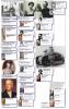
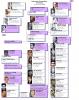
Thanks to Virginia’s tutorials, color box fill can always be use to clarify relationships.
However, when eliminating spousal connector lines and color fill is not used (or even if it is), two techniques can be used for clarification. Descendant and spouse boxes can touch or even overlap. Spouse boxes should also be offset from descendant boxes. An added benefit of offsetting spouse boxes from descendant boxes is that all descendants in a generation can be separately group selected from spouses using the shift-key/draw-rectangle method and vice-versa.
When there are multiple spouses and the genealogical complexities do not allow all spouse boxes to touch, different colored or gray-scale connector lines can be used to differentiate social from biological relationships.
The attached composite chart on Albert Einstein’s family shows the results of using these recommendations. Note: components of Elsa Einstein’s descendant chart were copied to Albert’s chart, then moved to the desired location.
Best wishes,
Mike Talbot.
PS: You may need to use full-screen view mode to scroll to the bottom of the attached chart.
-
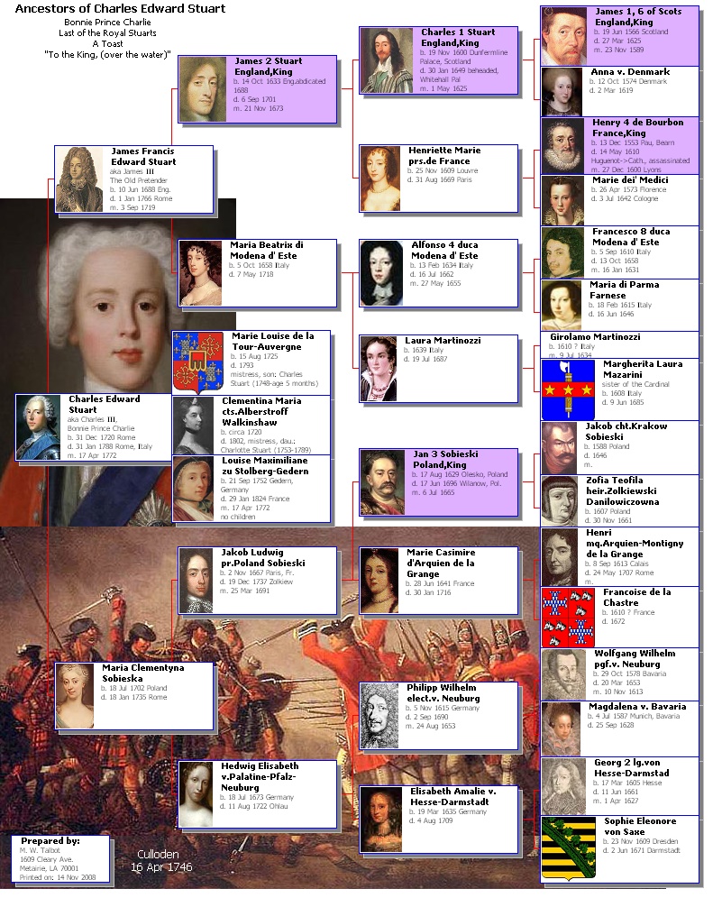
In the chart on Bonnie Prince Charlie, in the previous post, Stewart was consistently mispelled as Stuart. Well, at least I was consistent.
Sorry about that,
Mike Talbot
-
ok, I figured this much out,in the fan report, option button, chart style tab, int eh chart size section, the curved text generations, will rotate and curve the text for the specified number of generations (with no regard to box size in the outer sections).
So that solves the one issue I had, now if only we could force custom chart designs/framework.
Glad to hear it.
I'm not certain about what you mean about Custom chart designs/framework. Are you familiiar with importing pictures into your VCF chart? If not, study the VCF tool bars.
On the right, there is an icon that resembles a moon rising over two mountains. Click on it and you can load any picture (JPG, etc file) into your VCF chart.
You can expand or shrink the picture to the desired size. Select (left click on) the picture, then click on one of the handles (little gray squares at the corners and mid-points of the selected picture) while holding down the left mouse button and move the mouse. To preserve the aspect ratio of the picture, hold down the shift key simultaneously.
You can then force the picture to the back, as full or partial background by selecting it and click on the menu icon that resembles a yellow square partially covered by 2 smaller gray squares. This can solve one interpretation of framework that can be further dressed up with other pictures in either the forground or background of your chart.
Good luck and best wishes,
Mike Talbot
-
ok, here is a chart style similar to the one I would like to use: http://www.ancestor-circles.com/ancestorcircles2008_004.htmI wish to know if VCF is capable of custom out put like this, The text is readable without spinning it around. It is expandable, and linable with a bit of touch up work, and I like the overall look. (not necessarilly all the embellishments). The only data I wish to have is: Full name, DOB, POB, DOD, POD. I designed one in Photochop, more to my design likes. Thanks fro the input.
These are the nicest "text only" charts that I've seen. I know of no other service that can compare. Thank you for pointing them out. They might inspire some ideas.
However, to me, the most fun parts of genealogy charting are the inclusion of portraits and other relevant pictures. Without such exhibits, I'd settle for text only reports.
Best wishes,
Mike Talbot
-
This post continues Virginia's very nice tutorial example with similar charts to display possible variations.
You can change the chart's orientation (from right to left).
You can add exhibits (mainly, to see who's missing one).
You can use color to differentiate descendants from spouses (select components to be colored with a surrounding box while holding the control key down, instead of using the menu entry by generation. In this example, 10 selections were colored, 2 per gen.).
You can delete the standard TMG generated connector lines that make spouses resemble descendants.
By moving selections of components to reduce chart size:
You can show 5 generations on letter size page (attached chart is 8.25 x 5 inches),
You can change page orientation from landscape to portrait.
A similar second letter size chart is attached with a more complex set of descendants (8.25 x 10.25 inches).
The possibilities are endless. Cater to your whims and artistic talents. It just takes a little practice and experimentation to get an important chart to look the way that you want. Don't forget to save your intermediate work frequently.
Mike Talbot
-
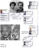
The first attached example is a 5 gen. Ancestor Chart on the ever-popular Bonnie Prince Charlie. The raw chart, as generated by TMG, was 11 x 16 inches, primarily due to many exhibits.
To edit the chart to one sheet of letter size paper, 15 selections of components were moved upwards with VCF, as follows. Select all components below the top box in the fifth generation and jog it upwards, taking care to not cover desired data or image parts. Do this sequentially for the last 14, fifth gen. boxes. Note that this resulted in a significant overlap of boxes in the fifth generation. With a little practice, you will learn to estimate how much to overlap. If you misjudge, you can tweak things the other way (a wee bit tedious but worth the effort).
The first 2 generations were then overlapped as described in a previous post, by moving two selections of components to the left.
A Descendant Chart was also generated to develop the boxes for his 3 spouses (1 wife, 2 mistresses, hand edited to name children). These 3 boxes were then copied and pasted to the Ancestor Chart. Several components had to be moved a little to make room for the spouse boxes at the desired place.
Two images were inserted into the chart and moved to the back to serve as partial background for the chart. Virginia's box fill color technique was used to emphasize royal ancestors. All of this was easier done than said.
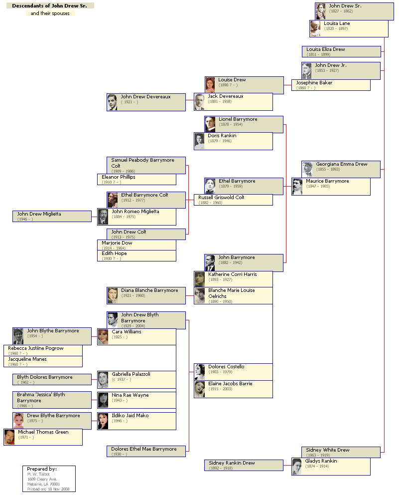
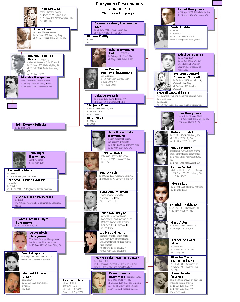
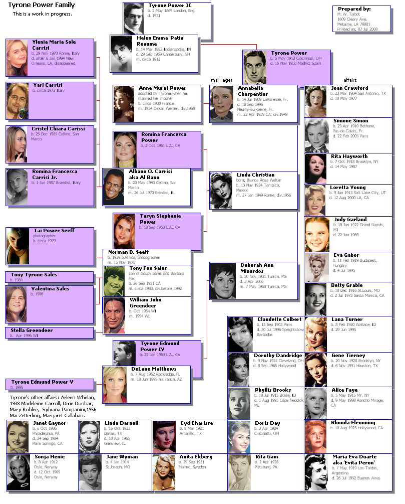
The next two attached examples are Descendant Charts on the Barrymore family and the Tyrone Power family and friends. Each was a large single Descendant Chart (about 1 x 2 feet) as generated by TMG. Components were moved with VCF so that each chart fit on a letter size page (8.25 x 10.45 on my printer).
Many connector lines were deleted and replaced with a simpler line structure. Red lines show biological connections, blue lines are for social connections. Note that many boxes overlap one another to save space. Yes, some genealogy chart standards are violated in these examples. But, when the meaning is clear, why not? Virginia's box fill color technique was used to emphasize the descendants.
These data and charts have been compiled over many years. Some modifications are recent to take advantage of valuable lessons learned from this forum. It should be noted that it is usually quicker and easier to modify a complex chart than to start from scratch when data changes occur (copy and paste components from new charts to old).
Interest in this topic still seems high. Please let me know when you tire of these example charts or would like more detail on a specific technique or a different application. Remember, you may have to switch to "full screen" mode to view the bottom of some charts.
Best wishes and enjoy VCF for those special charts,
Mike Talbot
-
Attached is a Relationship Chart made from a composite of standard VCF Ancestor Chart components. Text was hand added with VCF and two pictures were imported. This type of chart is a big hit with your relatives.
With this post, I renew my long standing plea and fervent wish that TMG replace the current word processor oriented Relationship Chart (useful but unattractive, inflexable, no exhibits and truncates text in long lines) with a VCF version.
Best wishes,
Mike Talbot
-
Attached is an update of Gen. Patton’s ancestor chart. It is augmented with data realized as omitted or discovered after it was first posted. Virginia’s color box fill technique (see that topic in this forum) was used to emphasize Patton’s royal descents.
Since the old chart had so much hand editing and additions from standard TMG charts, it was preserved. New standard charts were generated (this is a composite chart). Just the components that had changed on the new charts were copied and pasted over the old chart. This editing of the old chart resulted in far less work than editing a new composite TMG-VCF chart from scratch.
------------------------------------------------------------------------------------------------------------
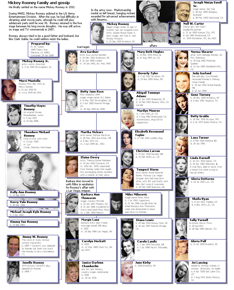
For old movie buffs, a chart on Mickey Rooney’s family and “friends” is also attached. It demonstrates how a large number of boxes can fit on a letter size chart. Explanatory text has been added both inside and outside the boxes.
This chart is not a composite of many charts. It began as a single large standard TMG Descendant Chart on Rooney’s father. Rooney’s paramours were each linked to him in the TMG database by a non-standard tag in the marriage group (the only non-standard tag that I ever use). Components were moved to force-fit them to letter size paper using VCF. Many connector lines were deleted and replaced by fewer lines for clarity. Photos were imported.
Note, that many boxes and components have been overlapped (such as boxes partially covering other boxes) to save space. Connector lines to non-biologically related people have been changed from red to blue and have been simplified and moved for clarity. Inserted photos have been used as partial backgrounds.
Since some of the Rooney data is based on celebrity rumors and gossip, it may contain errors.
-----------------------------------------------------------------------------------------------------------
Instead of frustration when serious projects hang-fire, you may find such non-related projects to be fun, relaxing and informative. It is certain that you will learn many useful techniques that can directly apply to your more serious pursuits. I know that I do.
Do it your way,
Mike Talbot
-
Hi all:I am trying to understand if the situation I have is normal operation or if there is an issue with the TMG tree display and/or Visual Chartform's output:
There is some inbreeding in this particular family tree, which may be the issue:
John and Dorcas begat John Jr. and Asa.
But Asa and John's offspring married each other and begat Sabra.
I was entering data from younger to older and realized that Asa's parents were the same as John Jr's, so I simply put the existing person# values for John and Dorcas as Asa's mom & dad.
The problem? In the output report, I would expect to see John and Dorcas once, but they show up twice (the second instances marked as "This person is a duplicate").
I was hoping the output generation would be smarter than this, and put them in only once and draw the appropriate lines to children John Jr. and Asa.
Also, in TMG tree view, John and Dorcas also show twice, but at least you can figure out its the same people because the person# values are shown (and are the same in both places).
Are these just limitations or are they bugs?
My main disappointment is that the chart output duplicates the couple instead of just drawing lines appropriately. Can this be fixed?
Regards,
Strathglass
This is neither a limitation nor a bug. It is a genealogical standard for ancestor charts. You can change the phrasiology of "This is a duplicate person" to a phrase of your choosing.
But all is not lost for your graphic desires. TMG provides the option to output charts to VCF. VCF is a TMG included program that allows you to edit and revise your charts to the way that you like them. Click on the Support Forums above and then on VCF for ideas on how to do it your way.
VCF requires a little practice. Try it, if you run into problems post your specific questions on that VCF forum.
Best wishes,
Mike Talbot
-
Hello!I would like to delete a whole familybranch from one of my projects along with all cousins, partners of cousins, their kids, etc. If i disconnect one of the couples i would have 2 separate trees and one of them i would like to get rif of. Is there a way to do so?
Thanks, Philipp
As Jim explained, you can do that.
But, why? What is gained? Memory is now cheap. You do loose all of that research. Can you be so sure of what your future genealogical interests will be? Think about it. Answer these questions to and for yourself, only.
As you mentioned, by deleting 2 links, you can prevent those people from appearing on your ancestor or descendant charts and reports. TMG can handle hundreds of thousands of people and many so called trees with no problem. You don't have to look at those that you don't want.
Best wishes, whatever you decide,
Mike Talbot

Talbot, Mike
in TMG Users' Genealogy Web Sites
Posted · Edited by Mike Talbot · Report reply
New and growing (that's the plan, anyway).
URL:
http://mwtalbotandassoc.design.officelive.com/default.aspx
Focus will be on Louisiana families and historical personages.
A few of the many surnames included:
Talbot, Gauthe, Gouner, Odenwald, Timothy, Patton, etc.
Come up and see me sometime,
Mike Talbot